
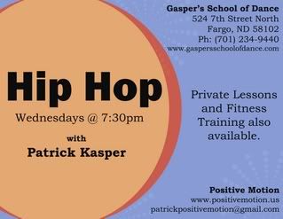
Last night I put together a post card / business card type flyer for my friend Patrick. He has a fitness program called "Positive Motion". He's really into fitness and keeping people in shape - especially youth. He asked if I could put a flyer together for him to hand out when he's out on the town (whether doing promotional things for the radio station he DJ's at or when he is out with friends). He also teaches at the Dance studio my boyfriend's family owns.
So I was more than thrilled when he asked if I could help him out by designing a flyer for his hip hop class. It's still sort of a work in progress. There are a few things i want to tweek - it looks good in black & white - but I am not super crazy about the colored version yet. I like the blue - but don't know if it is too much... I want to add black ring circles (to match the big ones in color...) but to give those circles more pop. So i just have to play around with that. But other wise I think I like it.
But I would LOVE feedback!
On another note - I have 2 boxes, 2 suitcases, 1 bag left to unpack! yippee - almost unpacked. And the cable guy comes tomorrow to fix our outlits for the cable and internet! So hopefully i'll have internet tomorrow evening when i get home from work!!!
1 comment:
Hi Lacey! K -- here's my comment...I like the flyer/card, but am not crazy about the colors -- its kind of "soft", but maybe that's just the colors on my computer-- it looks like almost peach and periwinkle, kind of wimpy, LOL. LOVE the composition and circles and stuff, though - that part looks great. Well-balanced, easy to read, etc. So, in my ALWAYS humble opinion (HA!), keep the card, play with the colors a little more:)
Post a Comment